I’ve seen this graphic from this blog going around, and while I agree that it is pretty and visually interesting, I find it mostly ineffective for communicating the magnitudes of pandemics over time. Our eyes and brains have a difficult time comparing the volume of spheres compared to a line on a bar chart. Additionally, the image is three dimensional in perspective, which further obfuscates direct comparisons.
Pandemics
So since I’m in quarantine, I decided to make a more basic image that allows one to compare magnitudes better.
First thing is to load the libraries needed along with the data set. This data set was scraped from the original webpage, and then slightly cleaned within excel (e.g. dates that were listed as present were changed to 2020). This data set has not been thoroughly checked by me for accuracy, but I did change the extent of the new world smallpox to be from first contacts (circa 1520) to 1792 instead of to present. This change was made because while smaller smallpox outbreaks continued to occur until the vaccine was discovered, the main outbreaks that decimated the native populations of the new world were mostly over by the late 1700s.
# libraries
library(tidyverse)

# load data
pandem_df <- readxl::read_xlsx("../../static/data/pandemic_data.xlsx")
This is the data table, for reference.
| Name | Time period | Type / Pre-human host | Death toll | death_toll | notes |
|---|---|---|---|---|---|
| Antonine Plague | 165-180 | Believed to be either smallpox or measles | 5M | 5.00e+06 | NA |
| Japanese smallpox epidemic | 735-737 | Variola major virus | 1M | 1.00e+06 | NA |
| Plague of Justinian | 541-542 | Yersinia pestis bacteria / Rats, fleas | 30-50M | 4.00e+07 | NA |
| Black Death | 1347-1351 | Yersinia pestis bacteria / Rats, fleas | 200M | 2.00e+08 | NA |
| New World Smallpox Outbreak | 1520-1792 | Variola major virus | 56M | 5.60e+07 | changed date range (extended to present) to 1520 - 1792, from wikipedia |
| Great Plague of London | 1665-1665 | Yersinia pestis bacteria / Rats, fleas | 100000 | 1.00e+05 | NA |
| Italian plague | 1629-1631 | Yersinia pestis bacteria / Rats, fleas | 1M | 1.00e+06 | NA |
| Cholera Pandemics 1-6 | 1817-1923 | V. cholerae bacteria | 1M+ | 1.00e+06 | NA |
| Third Plague | 1885-1885 | Yersinia pestis bacteria / Rats, fleas | 12M (China and India) | 1.20e+07 | NA |
| Yellow Fever | 1885-1900 | Virus / Mosquitoes | 100,000-150,000 (U.S.) | 1.25e+05 | original data stated late 1800s. Time period estimated 1885 to 1900 based on a/c |
| Russian Flu | 1889-1890 | Believed to be H2N2 (avian origin) | 1M | 1.00e+06 | NA |
| Spanish Flu | 1918-1919 | H1N1 virus / Pigs | 40-50M | 4.50e+07 | NA |
| Asian Flu | 1957-1958 | H2N2 virus | 1.1M | 1.10e+06 | NA |
| Hong Kong Flu | 1968-1970 | H3N2 virus | 1M | 1.00e+06 | NA |
| HIV/AIDS | 1981-2020 | Virus / Chimpanzees | 25-35M | 3.00e+07 | NA |
| Swine Flu | 2009-2010 | H1N1 virus / Pigs | 200000 | 2.00e+05 | NA |
| SARS | 2002-2003 | Coronavirus / Bats, Civets | 770 | 7.70e+02 | NA |
| Ebola | 2014-2016 | Ebolavirus / Wild animals | 11000 | 1.10e+04 | NA |
| MERS | 2015-2020 | Coronavirus / Bats, camels | 850 | 8.50e+02 | NA |
| COVID-19 | 2019-2020 | Coronavirus – Unknown (possibly pangolins) | 11,400 (as of Mar 20, 2020) | 1.14e+04 | NA |
Next we will add separate columns for the time period for later analysis.
# give a start and end date as well
pandem_df <- pandem_df %>%
  separate(`Time period`, sep = "-", c("Start", "End"), remove = FALSE) %>%
  mutate(Start = as.numeric(Start),
         End = as.numeric(End))
We will go ahead and make a few color palettes for later visualization. I’ve also gone ahead and made a caption to attribute the data source.
cols <- c("#999999", "#999999", "#999999", "#999999","#c51b7d", "#999999",
          "#999999", "#999999", "#999999", "#999999", "#999999", "#999999",
          "#999999", "#999999", "#999999", "#999999", "#999999", "#999999",
          "#999999", "#999999")

cols3 <- c("#613318", "#855732", "#d57500", "#668d3c", "#c51b7d", #earth tones
           "#ff0000", "#ff5600", "#6e48cf", "#000000", "#a00000", #aries mckennab
           "#004159", "#8c65d3", "#0052a5", "#00adce", "#00c590", # cool blue and green
           "#2affea", "#ff4141", "#2cc6c1", "#0093c0", "#cecece") #Aquarius mckennab

text_col <- ifelse(as.factor(pandem_df$Name) == "COVID-19", "#c51b7d", "#999999")

caption1 <- "Data scraped from https://www.visualcapitalist.com/history-of-pandemics-deadliest/.
       Dates for Smallpox adjusted from original source."
Visualizations
First we will look at the pandemics by decreasing death toll.
p <- pandem_df %>%
  ggplot(aes(x = reorder(Name, desc(-death_toll)), y = death_toll)) +
  geom_col(aes(fill = Name)) +
  scale_fill_manual(values = cols)  +
  theme_bw() +
  theme(axis.text.x = element_text(hjust=1, angle=45,
                                   colour = text_col),
        axis.text.y = element_text(colour = text_col)) +
  guides(fill = FALSE) +
  labs(title = "Death Toll of Selected Pandemics",
       y = "Total Deaths", x = "Pandemic",
       caption = caption1) + coord_flip()

p + scale_y_continuous(breaks = c(1*10^1, 1*10^7, 1*10^8, 2*10^8 ),
limits = c(NA, 2*10^8)) 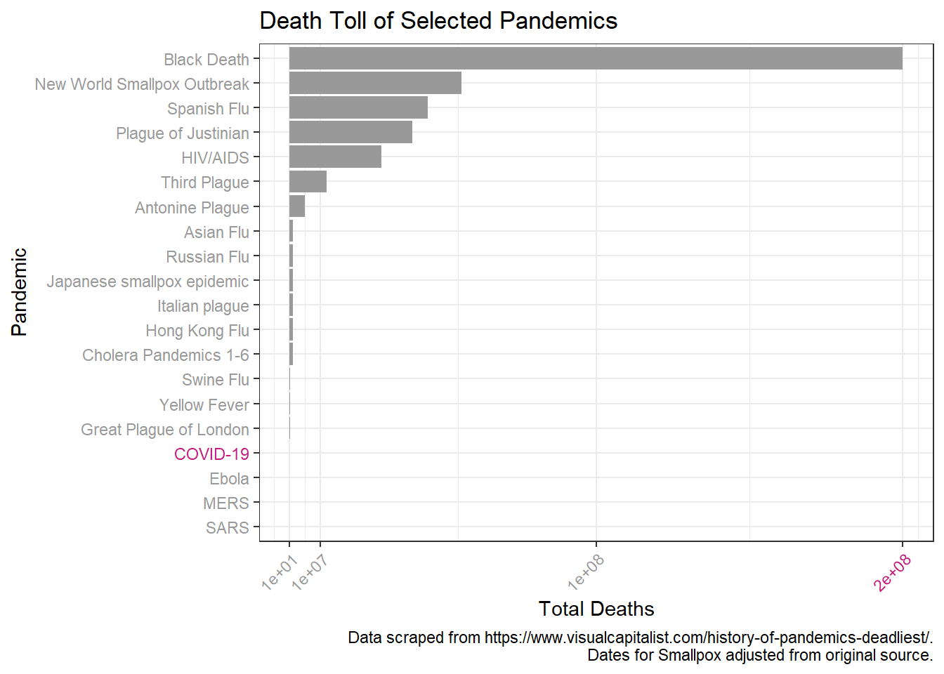
Looks like a log scale would help here. I’ll also add in more breaks to aid in comparison over the log scale.
p +  scale_y_log10(breaks = c(1*10^1, 1*10^2, 1*10^3, 1*10^4, 1*10^5,
                           1*10^6, 1*10^7, 1*10^8, 1*10^9, 1*10^10),
limits = c(NA, 1*10^9)) 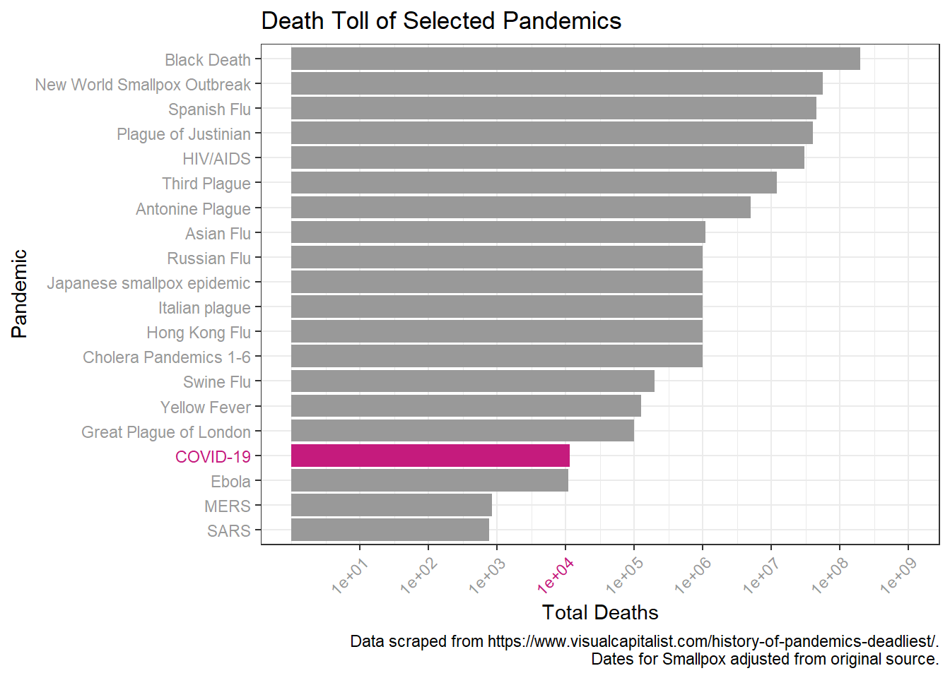
We can then examine the death toll over time.
p <- pandem_df %>%
  ggplot(aes(x = reorder(Name, desc(-Start)), y = death_toll)) +
  geom_col(aes(fill = Name)) +
  scale_fill_manual(values = cols) +
  theme_bw() +
  theme(axis.text.x = element_text(hjust=1, angle=45),
        axis.text.y = element_text(colour = text_col)) +
  guides(fill = FALSE) +
  labs(title = "Death Toll of Selected Pandemics",
       subtitle = "Ordered by least recent to most recent",
       y = "Total Deaths", x = "Pandemic",
       caption = caption1) + coord_flip()

p + scale_y_continuous(breaks = c(1*10^1, 1*10^7, 1*10^8, 2*10^8 ),
                     limits = c(NA, 2*10^8))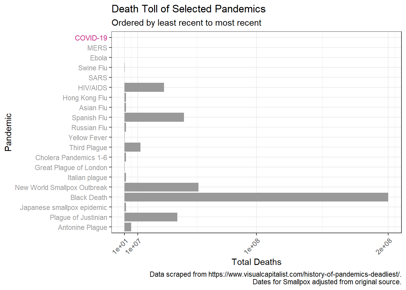
Again we will do a log transformation to better visualize.
 p + scale_y_log10(breaks = c(1*10^1, 1*10^2, 1*10^3, 1*10^4, 1*10^5,
                           1*10^6, 1*10^7, 1*10^8, 1*10^9, 1*10^10),
                limits = c(NA, 1*10^9))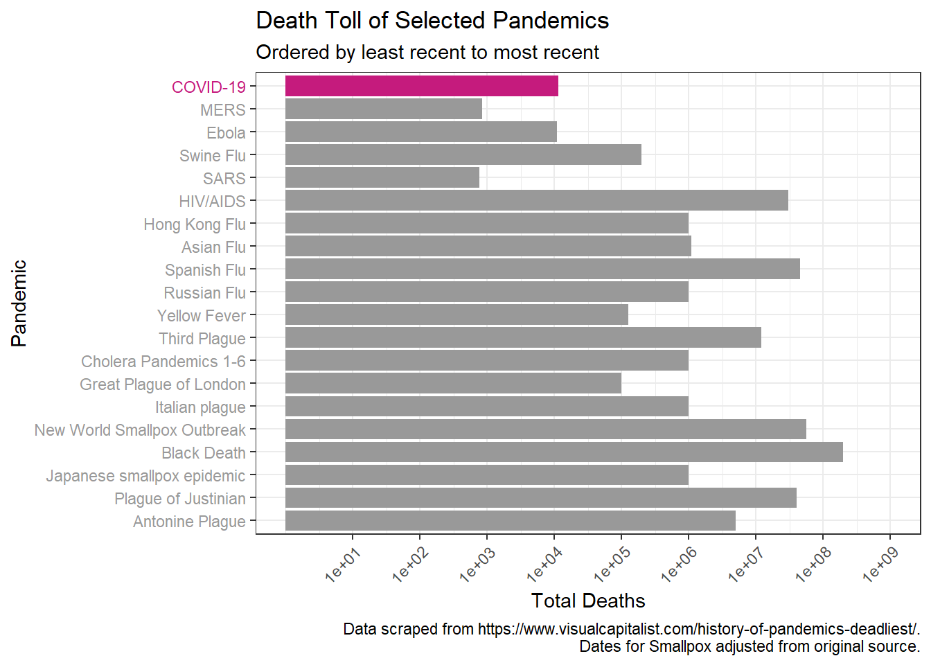
We can also zoom our focus in to how the death toll compares to the most recent pandemics that have occurred during the modern medicine period in the 20th century.
# comparing to 20th century pandemics
pandem_19_df <- pandem_df %>%
  filter(Name %in% c("HIV/AIDS", "SARS", "Swine Flu", "Ebola", "MERS", "COVID-19"))
text_col <- ifelse(pandem_19_df$Name == "COVID-19", "#c51b7d", "#999999")
cols <- ifelse(pandem_19_df$Name == "HIV/AIDS", "#c51b7d", "#999999")

pandem_df %>%
  filter(Name %in% c("HIV/AIDS", "SARS", "Swine Flu", "Ebola", "MERS", "COVID-19")) %>%
  ggplot(aes(x = reorder(Name, desc(-Start)), y = death_toll)) +
  geom_col(aes(fill = Name)) +
  scale_fill_manual(values = cols) +
  scale_y_log10((breaks = c(1*10^1, 1*10^2, 1*10^3, 1*10^4, 1*10^5,
                                1*10^6, 1*10^7,1*10^8))) +
  theme_bw() +
  theme(axis.text.x = element_text(hjust=1, angle=45),
        axis.text.y = element_text(colour = text_col)) +
  guides(fill = FALSE) +
  labs(title = "Death Toll of Selected Pandemics",
       subtitle = "Ordered by least recent to most recent",
       y = "Total Deaths (log scale)", x = "Recent Pandemics",
       caption = caption1) + coord_flip()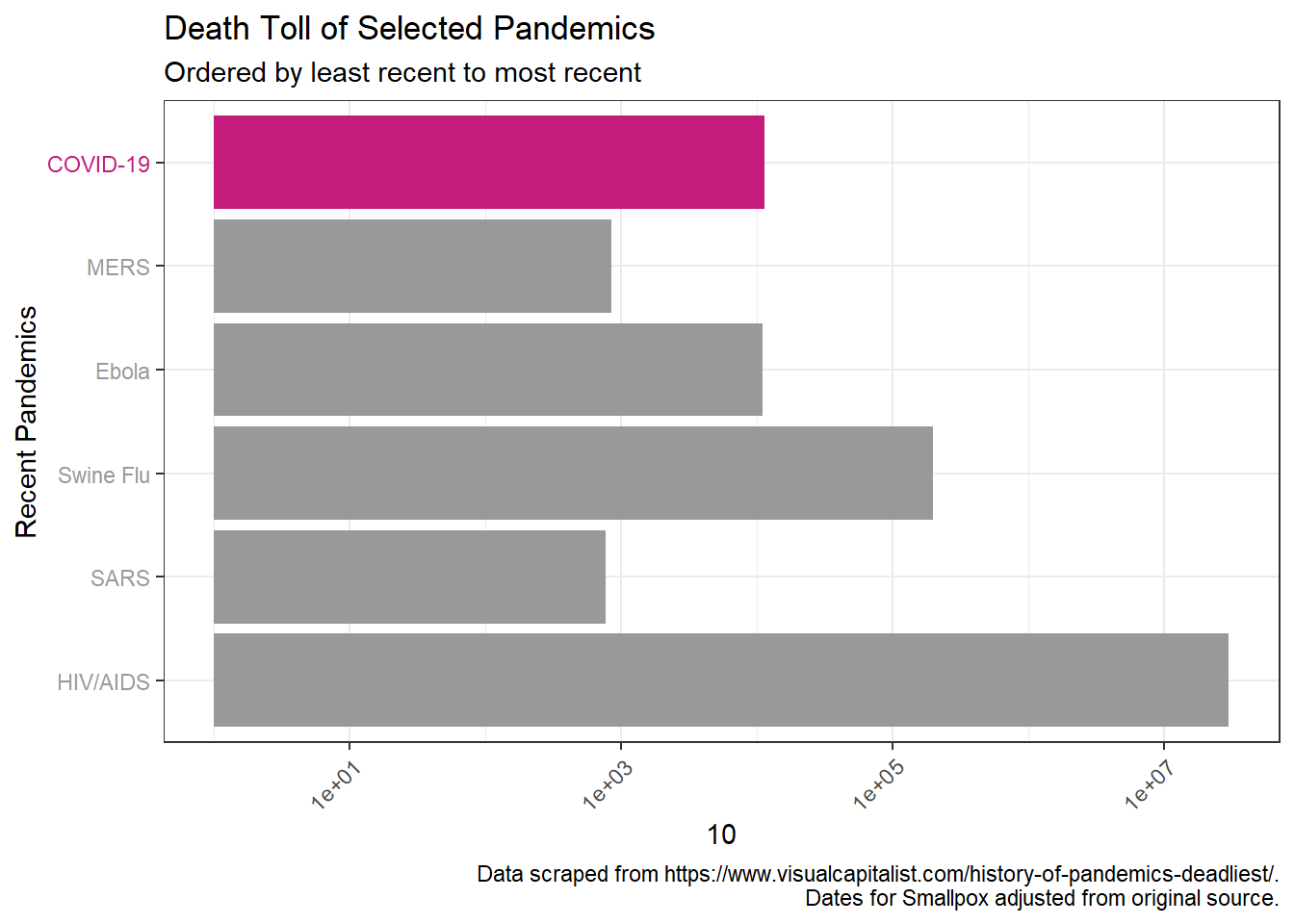
The deaths from HIV are an order of magnitude greater than the others, so if we drop that, we can compare on the normal scale without log transformation. Immediately notable is that despite the pandemic not being close to over, CoVD-19 has already killed more people than the previous coronavirus pandemics (MERS, SARS), and will be much deadlier than Ebola. Depending on containment efforts by governments, it seems likely that the death toll will exceed that of swine flu as well at this point.
#normal scale, no HIV/AIDS
pandem_df %>%
  filter(Name %in% c("SARS", "Swine Flu", "Ebola", "MERS", "COVID-19")) %>%
  ggplot(aes(x = reorder(Name, desc(-Start)), y = death_toll)) +
  geom_col(aes(fill = Name)) +
  scale_fill_manual(values = cols) +
  theme_bw() +
  theme(axis.text.x = element_text(hjust=1, angle=45),
        axis.text.y = element_text(colour = text_col)) +
  guides(fill = FALSE) +
  labs(title = "Death Toll of Selected Pandemics",
       subtitle = "Ordered by least recent to most recent",
       y = "Total Deaths", x = " Recent Pandemics",
       caption = caption1) + coord_flip()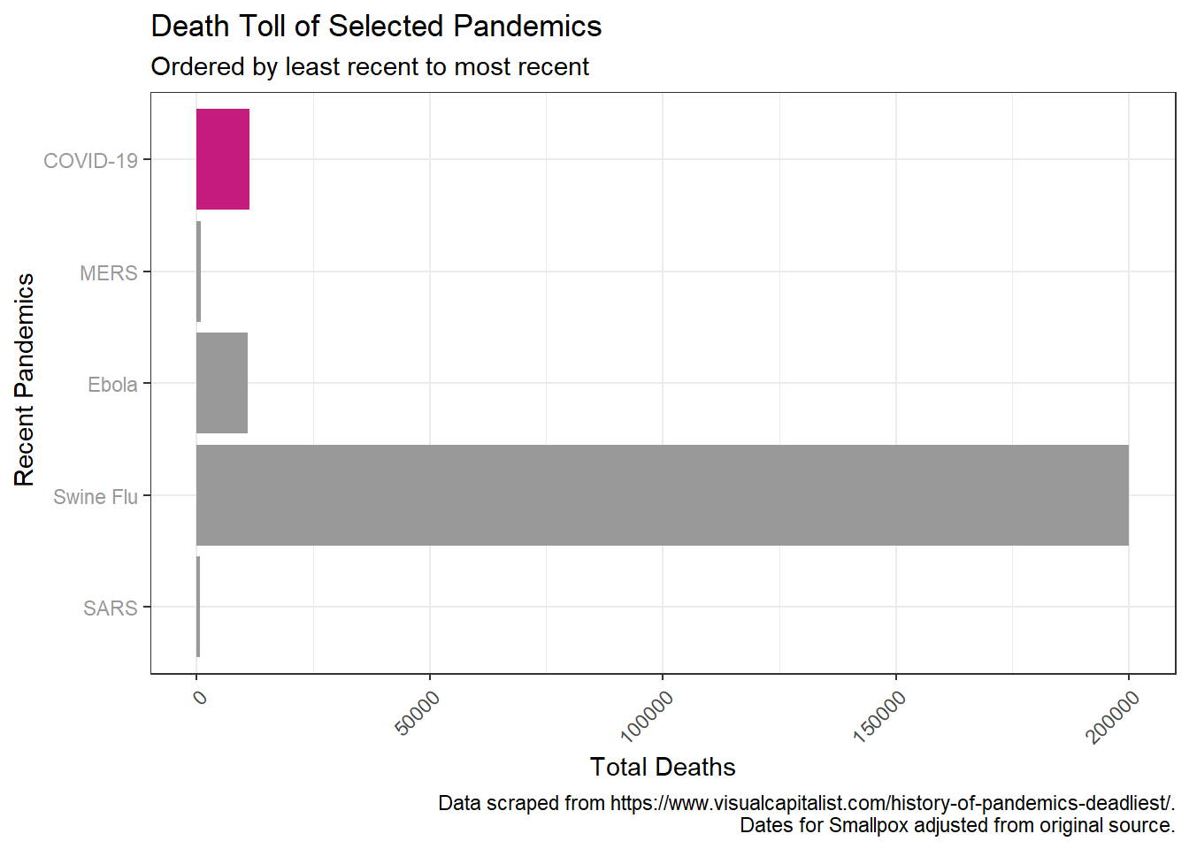
Finally I thought it would be interesting to examine the pandemics over time. Using geom_rect() we can see both the death toll on the y-axis, as well as the length of each pandemic on the x-axis. It’s interesting to see different disease dynamics this way. I think most notable to me is the HIV/AIDS pandemic. This pandemic looks similar to pre-modern medicine era ones despite occurring recently, and is indicative of the failure of government to act.
# over time with time extent (geom_rect)

pandem_df %>%
  ggplot(aes(ymin = 0, ymax = death_toll, fill = Name)) +
  geom_rect(aes(xmin = Start, xmax = End)) +
  theme_bw() +
  theme(legend.position="bottom") +
  scale_y_log10(breaks = c(1*10^1, 1*10^2, 1*10^3, 1*10^4, 1*10^5,
                            1*10^6, 1*10^7, 1*10^8, 1*10^9)) +
  scale_fill_manual(values = cols3) +
  labs(title = "Pandemics Throughout History",
       x = "Year", y = "Death Toll (log scale)",
       caption = caption1)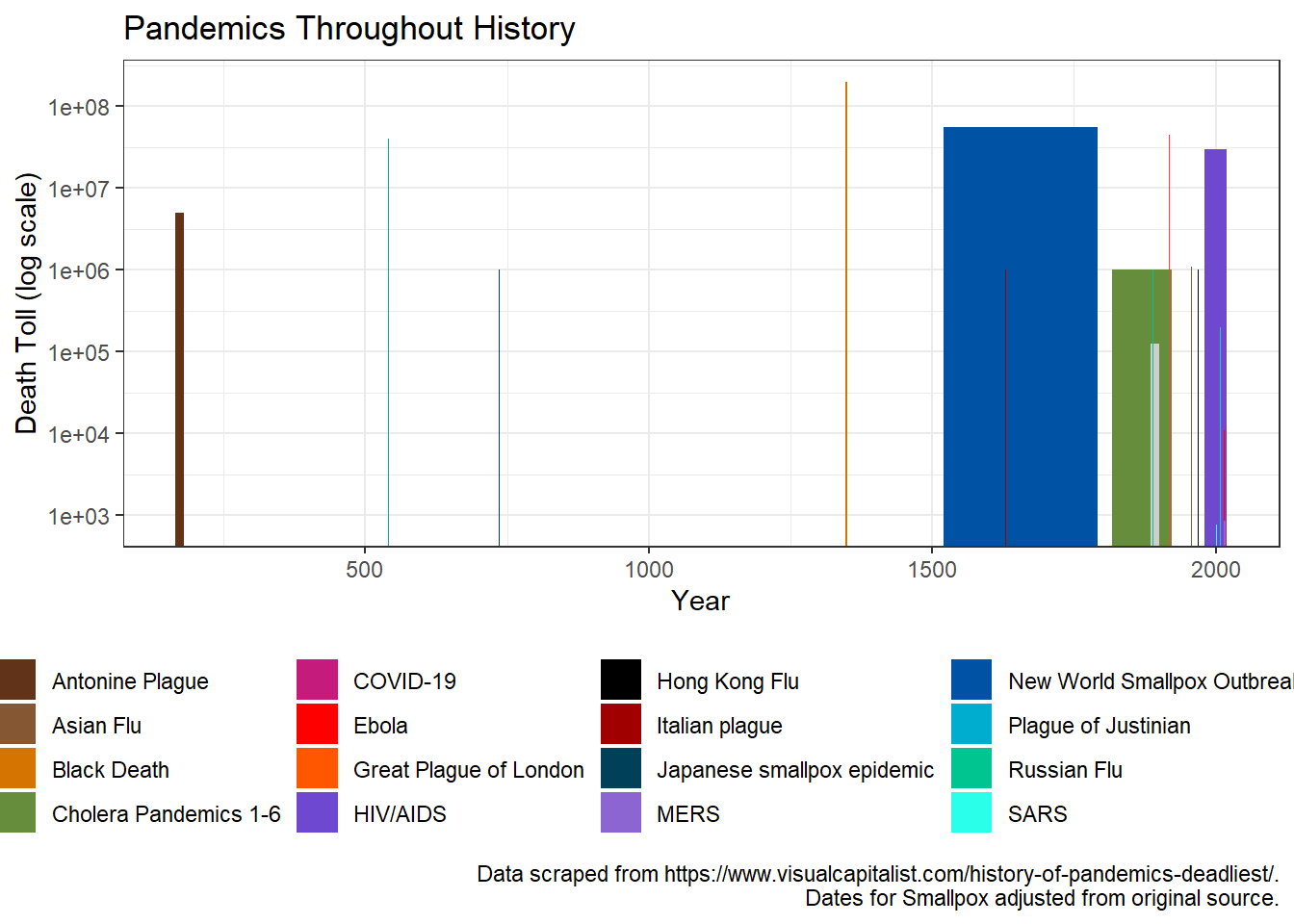
That’s it for now. I hope everyone is socially distancing and doing their part to help prevent this current pandemic from looking like pandemics from the past!