Sometimes in environmental regulation, we are unable to find a clear cause-effect relationship between a known stressor and a known response due to confounders. This is a common problem when attempting to determine acceptable nutrient regimes for some systems. For example, Florida Department of Environmental Protection (FDEP) was required to promulgate Numeric Nutrient Criteria for estuaries as the result of a lawsuit, yet no straightforward cause-effect relationship could be found for Total Nitrogen (TN) and/or Total Phosphorus (TP) leading to excess Chlorophyll a, which in turn lead to submerged aquatic vegetation (SAV) die-off resulting in the loss of this key habitat for these highly productive systems.
Due to this difficulty, FDEP used a maintain existing conditions approach, in which long term data sets for estuaries assessed to have acceptable/healthy biology were used to calculate criteria. This approach involved taking the entire distribution of data for a particular estuary and taking the 80th percentile of the data. The estuary would then be deemed impaired if it exceeded the Annual Geometric Mean (AGM) more than once in a three year period (a 10 percent false positive rate).
I mention this background because a recent project I was involved in employed this approach in a slightly modified format, and want to highlight the potential challenges with applying the approach. We studied a series of spatially related lakes which we found to have different levels of human disturbance, and different levels of associated biological health. However, stakeholders like to have simple water quality goals to summarize the state of the lakes. We thought: no problem FDEP has done this before. We will take the group of lakes deemed healthy for their biology (and have a low human impact score) and determine the 80th percentile of this data distribution. However, it soon became clear that the approach developed for an individual estuary was more challenging when applied to a group of lakes. Namely this is a lesson to always check the underlying distribution of your data sets.
I think it’s easiest to demonstrate with an example.
Load packages and set the size of figures.
library(tidyverse)## -- Attaching packages --------------------------------------- tidyverse 1.2.1 --## v ggplot2 2.2.1 v purrr 0.2.4
## v tibble 1.4.2 v dplyr 0.7.4
## v tidyr 0.8.0 v stringr 1.3.0
## v readr 1.1.1 v forcats 0.3.0## -- Conflicts ------------------------------------------ tidyverse_conflicts() --
## x dplyr::filter() masks stats::filter()
## x dplyr::lag() masks stats::lag()# set figure size
knitr::opts_chunk$set(fig.width=12, fig.height=9, message = FALSE,
warning = FALSE)Next let’s make a sample data set. For this data set, I have designated five lakes as healthy, and 2 as degraded. Each has an associated result which could be any parameter we were interested in setting a goal/limit for before taking action (e.g. Total Nitrogen).
# make several different distributions:
set.seed(1234)

# this data set has factor of cond (condition), and then a distribution of results
data_df <- data.frame(lake = factor(rep(c("A","B", "C", "D", "E", "F", "G"),
                                        each=200)),
                      bio = factor(rep(c("healthy", "healthy", "healthy",
                                         "healthy", "healthy", "degraded",
                                         "degraded"), each=200)),
                   result = c(rnorm(200, mean = 1),
                              rnorm(200, mean = 2),
                              rnorm(200, mean = 3),
                              rnorm(200, mean = 4),
                              rnorm(200, mean = 5),
                              rnorm(200, mean = 8),
                              rnorm(200, mean = 9)))
We’ll go ahead and designate a color palette, base plot template, and an additional data frame of the the healthy lakes.
data_ref_df <- data_df %>% filter(bio == "healthy")

# set custom colors for lakes. picked out using colorbrewer2.org:
lake_col <- c("#01665e", "#5ab4ac", "#c7eae5", "#f5f5f5", "#f6e8c3", "#d8b365",
              "#8c510a")
# bio colors:
bio_col <- c("#8c510a", "#01665e")

# base data for plots along with theme
p <- ggplot(data_ref_df, aes(x=result)) +
        theme_bw() + scale_fill_manual(values = lake_col)
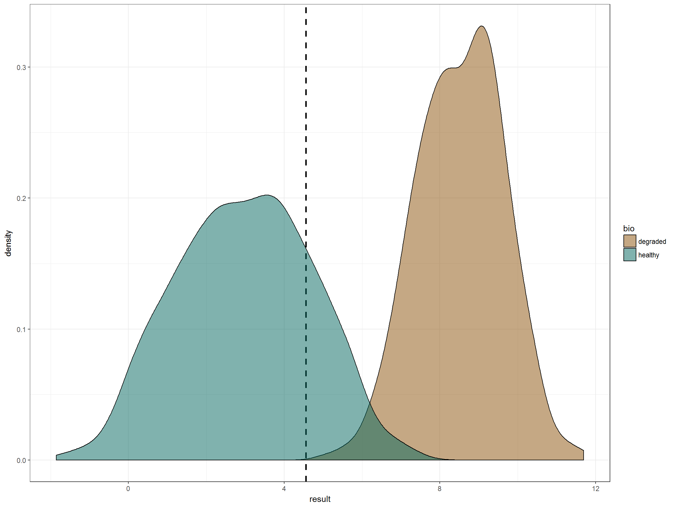
Let’s graph the two distributions of lake classification (healthy and degraded) and draw a line at the 80th percentile of the healthy lake distribution. This appears to give us close to no false negatives, and an acceptable rate of false positives if we make the criteria a “more than once in a three year period”. Looks great, right?
p + geom_vline(data = data_ref_df,
               xintercept = quantile(data_ref_df$result, 0.8),
               linetype = "dashed", size = 1) + # 80th percentile
    geom_density(data = data_df, aes(fill = bio),
alpha = 0.5) + scale_fill_manual(values = bio_col) 
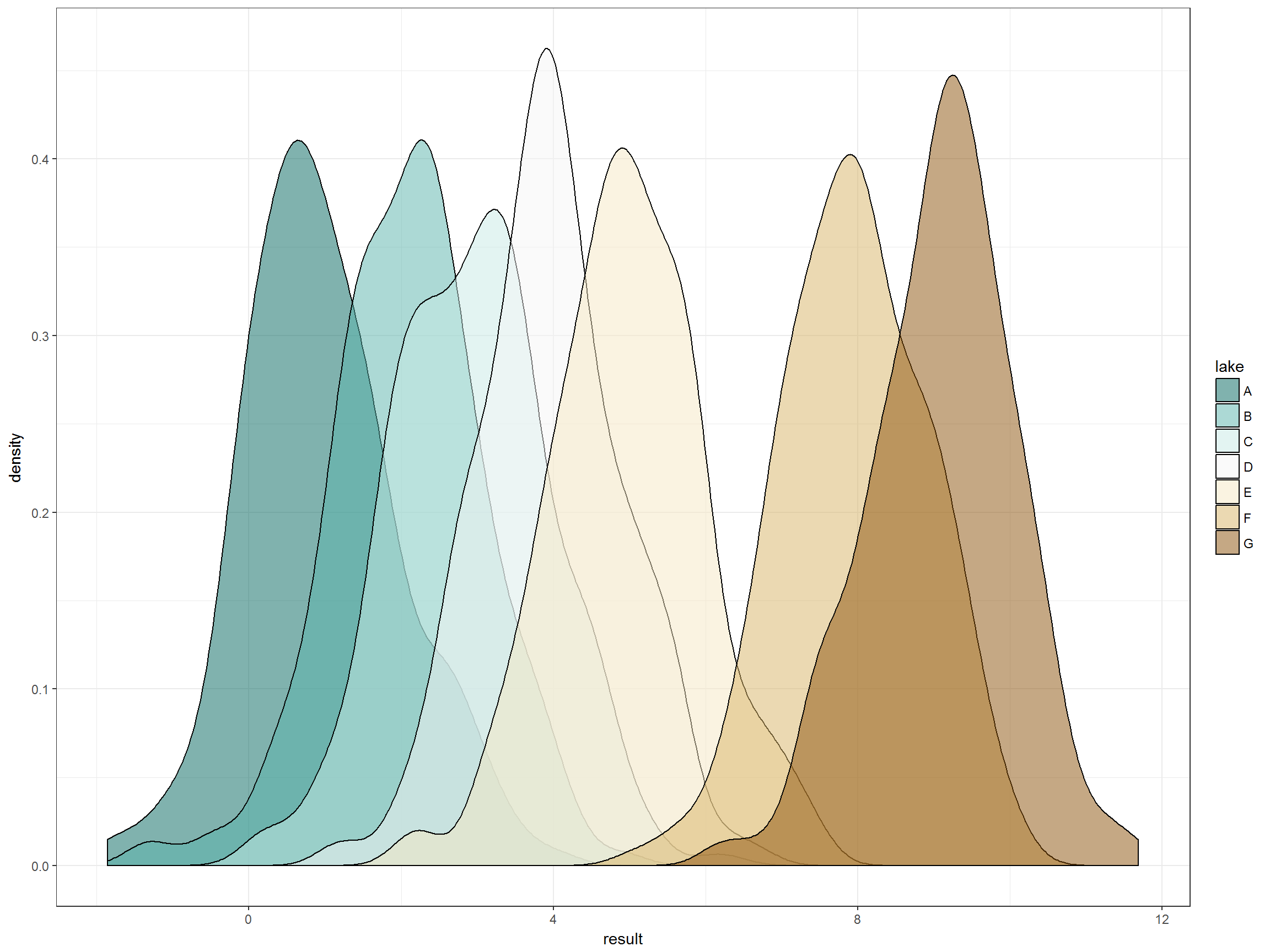
However, if we were to stop here, it would be a mistake. The reason is that our healthy distribution is actually composed of five different lakes, each with their own distribution of values.
Let’s look at the distribution of data for each lake:
 p +
        geom_density(data = data_df, aes(fill=lake), alpha = 0.5) +
        theme_bw()
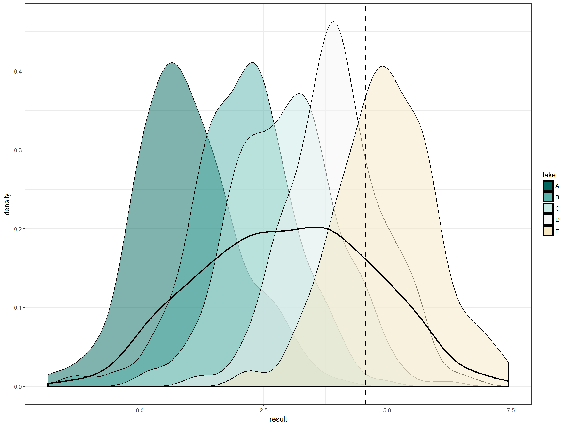
Right, so the five lakes deemed to be healthy based on biology do not have identical distributions of this pretend water quality parameter. Let’s look at those distributions that all fall under the “good” biology designation in more detail. Here we have the individual lake distributions and then the overall distribution of lakes. Again we have the 80th percentile of that overall distribution. Immediately obvious is that one of the lakes that we have deemed healthy based on biology would be deemed impaired by this water quality goal in more than 50% of samples. That seems crazy.
# everything together:
p +
        geom_density(aes(fill=lake), alpha = 0.5) + # distribution of factors
        geom_vline(xintercept = quantile(data_ref_df$result, 0.8),
                   linetype = "dashed", size = 1) + # 80th percentile
         geom_density(size = 1) # overall distribution
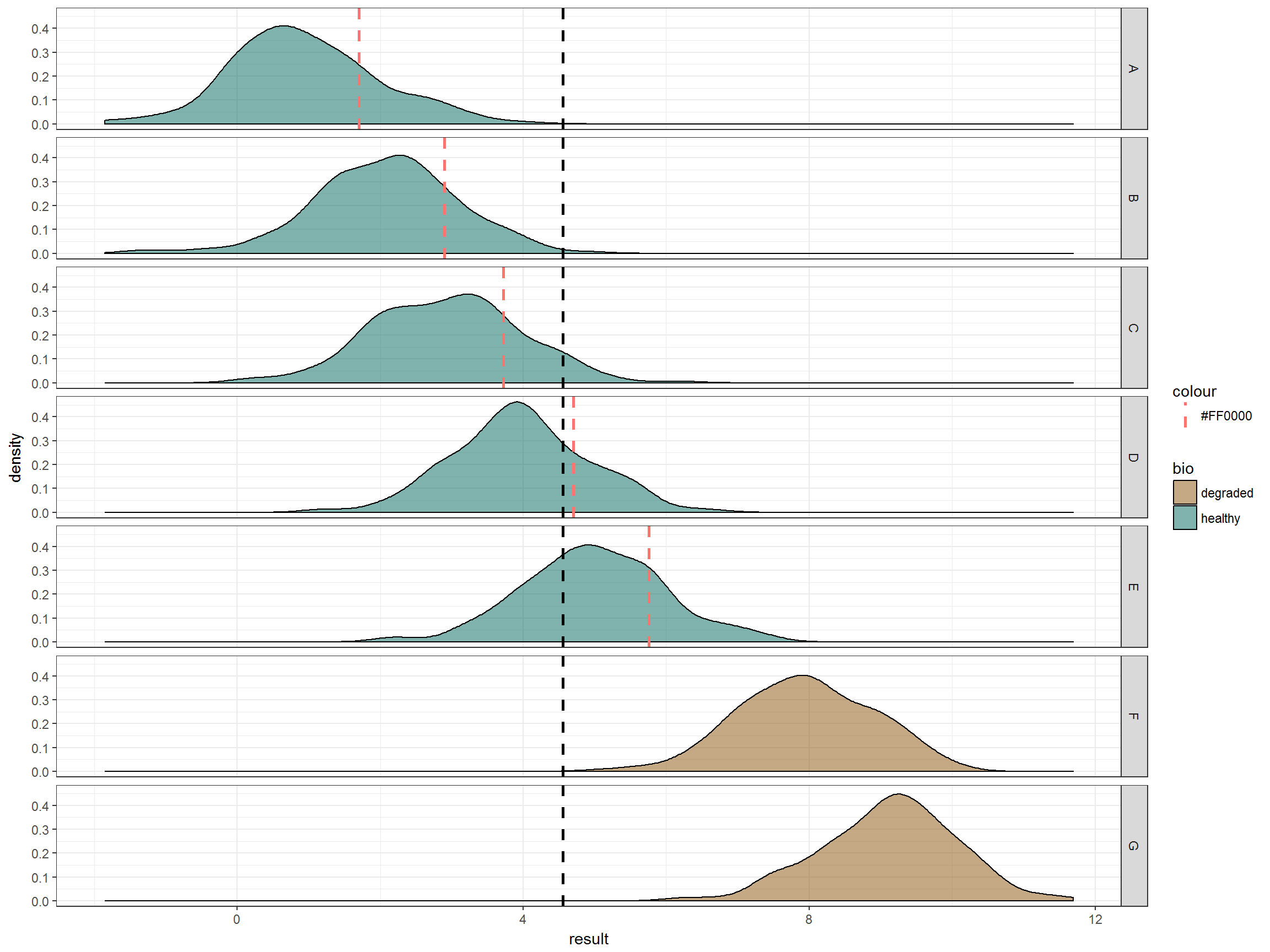
This becomes clearer when making facets of the data.
ggplot(data_df, aes(x=result)) +  theme_bw() +
        geom_density(aes(fill=bio), alpha = 0.5) + # distribution of factors
        geom_vline(xintercept = quantile(data_ref_df$result, 0.8),
                   linetype = "dashed", size = 1) + # 80th percentile
facet_grid(lake~.) + scale_fill_manual(values = bio_col) 
Finally, here is what it would look like if we took the 80th percentile of each of the 5 lakes.
# get the 80th percentile of each underlying distribution
data2_df <- data_ref_df %>% group_by(lake) %>%
        summarise(quant80 = quantile(result, 0.8))

# graph
ggplot(data_df, aes(x=result)) +  theme_bw() +
        geom_density(aes(fill = bio), alpha = 0.5) + # distribution of factors
        theme_bw() +
         geom_vline(data = data2_df,
                 aes(xintercept = as.numeric(quant80),
                   colour = "#FF0000"),
                 linetype = 2, size = 1) + # 80th percentile of each dist
         geom_vline(xintercept = quantile(data_ref_df$result, 0.8),
                   linetype = 2, size = 1) +
facet_grid(lake~.) + scale_fill_manual(values = bio_col) 
So we see our problem: it is not appropriate to promulgate water quality criteria using an overall distribution if the underlying distributions of data sets are not random but are instead a result of other structures of the data.
There are many approaches for setting water quality goals given what we have learned about the underlying structure of our data. For example, we might decide to give each lake its own goal based on the same math. However, how do we generalize a goal to lakes that do not currently meet our goal of a healthy biological community?
Ultimately for our project, we decided to take a two step approach:
- Evaluate water quality goals based on entire distribution approach. This means that one or two lakes will not meet the goals because of the underlying distributions while still having healthy and well balanced biology.
- If a water quality goal is not being met, evaluate the biology. Is the plant community trending downwards or not similar to our goal lake data set? Is the level of human disturbance increasing as these downward water quality trends are occurring? If so, take remedial actions.